Ah Rpg Maker, what a nice software to create RPGs, but all the way limited without plug-ins, let's even say trivial under some characteristics, let's take LOADING as an example, it's one of the most trivial and ugly things to see! { "lightbox_close": "Close", "lightbox_next": "Next",
Ah Rpg Maker, what a nice software to create RPGs, but all the way limited without plug-ins, let's even say trivial under some characteristics, let's take LOADING as an example, it's one of the most trivial and ugly things to see!
You just look at this...Banal.
If you want to make your game as professional as possible, it must also be interesting while waiting for loading.
I'm here today to help you by giving you a tutorial and some of my
free codes!
Let's start step by step.
-First of all you need to open your project folder
-There will be a "css" folder inside
-Just open it
- Then you will see a "game.css" file (if you have no active extension then you will only see the "game" file
-You need to open it using Note or Visual Studio Code or Note++ or any program that reads the file, I recommend VSCode
(
Visual Studio Code -
Note++)
-Then let's edit Code!
it will be easy don't worry.
-Scroll down and find "
#loadingSpinner" (or press ctrl + f and digit "loading")
-Just comment or delete it
-To comment use
/**/
/*this is a comment*/
-So copy and paste my code
-Save file and open your game
--------------------------------------------------------------
Well some code for you
1- "Atom Spinner"
it's pretty cool loading
CSS:
#loadingSpinner {

    margin: auto;

    position: absolute;

    top: 0px;

    left: 0px;

    right: 0px;

    bottom: 0px;

    width: 120px;

    height: 120px;

    z-index: 10;

}

#loadingSpinner {

    transform: rotateZ(45deg);

    perspective: 1000px;

    border-radius: 50%;

    width: 48px;

    height: 48px;

    color: rgb(255, 251, 0);

  }

  #loadingSpinner:before,

  #loadingSpinner:after {

      content: '';

      display: block;

      position: absolute;

      top: 0;

      left: 0;

      width: inherit;

      height: inherit;

      border-radius: 50%;

      transform: rotateX(70deg);

      animation: 1s spin linear infinite;

    }

    #loadingSpinner:after {

      color: #00ffff;

      transform: rotateY(70deg);

      animation-delay: .4s;

    }


  @keyframes rotate {

    0% {

      transform: translate(-50%, -50%) rotateZ(0deg);

    }

    100% {

      transform: translate(-50%, -50%) rotateZ(360deg);

    }

  }


  @keyframes rotateccw {

    0% {

      transform: translate(-50%, -50%) rotate(0deg);

    }

    100% {

      transform: translate(-50%, -50%) rotate(-360deg);

    }

  }


  @keyframes spin {

    0%,

    100% {

      box-shadow: .2em 0px 0 0px currentcolor;

    }

    12% {

      box-shadow: .2em .2em 0 0 currentcolor;

    }

    25% {

      box-shadow: 0 .2em 0 0px currentcolor;

    }

    37% {

      box-shadow: -.2em .2em 0 0 currentcolor;

    }

    50% {

      box-shadow: -.2em 0 0 0 currentcolor;

    }

    62% {

      box-shadow: -.2em -.2em 0 0 currentcolor;

    }

    75% {

      box-shadow: 0px -.2em 0 0 currentcolor;

    }

    87% {

      box-shadow: .2em -.2em 0 0 currentcolor;

    }

  }
2- "Classic Spinner"
I like thi one, its so neutral
CSS:
#loadingSpinner {

    margin: auto;

    position: absolute;

    top: 0px;

    left: 0px;

    right: 0px;

    bottom: 0px;

    width: 48px;

    height: 48px;

    z-index: 10;

}


#loadingSpinner {

    width: 96px;

    height: 16px;

    display: inline-block;

    background-color: #FFF;

    border: 1px solid #FFF;

    border-radius: 4px;

    background-image: linear-gradient(45deg, rgba(0, 0, 0, 0.25) 25%, transparent 25%, transparent 50%, rgba(0, 0, 0, 0.25) 50%, rgba(0, 0, 0, 0.25) 75%, transparent 75%, transparent);

    font-size: 30px;

    background-size: 1em 1em;

    box-sizing: border-box;

    animation: barStripe 1s linear infinite;

  }


  @keyframes barStripe {

    0% {

      background-position: 1em 0;

    }

    100% {

      background-position: 0 0;

    }

  }
3- "Coin Spinner"
It's like a coin
Pretty simple animation
CSS:
#loadingSpinner {

    margin: auto;

    position: absolute;

    top: 0px;

    left: 0px;

    right: 0px;

    bottom: 0px;

    width: 120px;

    height: 120px;

    z-index: 10;

    width: 96px;

    height: 96px;

    display: inline-block;


    border-radius: 50%;

    background: #33CCCC;;

    animation: lds-circle 2.4s cubic-bezier(0, 0.2, 0.8, 1) infinite;

  }

  @keyframes lds-circle {

    0%, 100% {

      animation-timing-function: cubic-bezier(0.5, 0, 1, 0.5);

      background: #00ffff;

    }

    0% {

      transform: rotateY(0deg);

      background: #00ccff;

    }

    50% {

      transform: rotateY(1800deg);

      animation-timing-function: cubic-bezier(0, 0.5, 0.5, 1);

      background: #0099ff;

    }

    100% {

      transform: rotateY(3600deg);

      background: #00ccff;

    }

  }
4- "Wave Spinner"
This remember me a sonic wave
CSS:
#loadingSpinner {

    display: inline-block;

    margin: auto;

    width: 80px;

    height: 80px;

    top: 0px;

    left: 0px;

    right: 0px;

    bottom: 0px;

  }

  #loadingSpinner  {

    position: absolute;

    border: 4px solid #fff;

    opacity: 1;

    border-radius: 50%;

    animation: lds-ripple 1s cubic-bezier(0, 0.2, 0.8, 1) infinite;

  }

  #loadingSpinner :nth-child(2) {

    animation-delay: -0.5s;

  }

  @keyframes lds-ripple {

    0% {

      top: 0px;

      left: 0px;

      width: 0;

      height: 0;

      opacity: 0;

    }

    4.9% {

      top: 0px;

      left: 0px;

      width: 0;

      height: 0;

      opacity: 0;

    }

    5% {

      top: 0px;

      left: 0px;

      width: 0;

      height: 0;

      opacity: 1;

    }

    100% {

      top: 0px;

      left: 0px;

      width: 72px;

      height: 72px;

      opacity: 0;

    }

  }
5- "Cubyc Spinner"
It's a simple loading but so cool
CSS:
#loadingSpinner {

    margin: auto;

    position: absolute;

    top: 0px;

    left: 0px;

    right: 0px;

    bottom: 0px;

    width: 48px;

    height: 48px;

    z-index: 10;

}


#loadingSpinner {

    width: 48px;

    height: 48px;

    background: #fff;

    animation: rotate 1s linear infinite;

  }


  @keyframes rotate {

    0% {

      transform: rotate(0deg) scale(0.2);

      border-radius: 10%;

    }

    50% {

      transform: rotate(180deg) scale(1.5);

      border-radius: 50%;

    }

    100% {

      transform: rotate(360deg) scale(0.2);

      border-radius: 10%;

    }

  }
6- "Interchange Spinner"
Lovely loading
CSS:
#loadingSpinner {

    margin: auto;

    position: absolute;

    top: 0px;

    left: 0px;

    right: 0px;

    bottom: 0px;

    width: 120px;

    height: 120px;

    z-index: 10;

}


#loadingSpinner {

    width: 48px;

    height: 48px;

    border-radius: 50%;

    display: inline-block;

    border-top: 4px solid rgb(134, 134, 134);

    border-right: 4px solid transparent;

    box-sizing: border-box;

    animation: rotation 1s linear infinite;

  }

  #loadingSpinner:after {

    content: '';

    box-sizing: border-box;

    position: absolute;

    left: 0;

    top: 0;

    width: 48px;

    height: 48px;

    border-radius: 50%;

    border-left: 4px solid #2e2e2e;

    border-bottom: 4px solid transparent;

    animation: rotation 0.5s linear infinite reverse;

  }

  @keyframes rotation {

    0% {

      transform: rotate(0deg);

    }

    100% {

      transform: rotate(360deg);

    }

  }
7- "Chase Spinner"
Nice to be loading
CSS:
#loadingSpinner {

    margin: auto;

    position: absolute;

    top: 0px;

    left: 0px;

    right: 0px;

    bottom: 0px;

    width: 120px;

    height: 120px;

    z-index: 10;

}


#loadingSpinner {

    width: 48px;

    height: 48px;

    border-radius: 50%;

    display: inline-block;

    border-top: 4px solid rgb(161, 161, 161);

    border-right: 4px solid transparent;

    box-sizing: border-box;

    animation: rotation 1s linear infinite;

  }

  #loadingSpinner:after {

    content: '';

    box-sizing: border-box;

    position: absolute;

    left: 0;

    top: 0;

    width: 48px;

    height: 48px;

    border-radius: 50%;

    border-bottom: 4px solid #474747;

    border-left: 4px solid transparent;

  }

  @keyframes rotation {

    0% {

      transform: rotate(0deg);

    }

    100% {

      transform: rotate(360deg);

    }

  }
----------------------------------------------------------
Some Extra for you
1 Extra Code
CSS:
#loadingSpinner {
    margin: auto;
    position: absolute;
    top: 0px;
    left: 0px;
    right: 0px;
    bottom: 0px;
    width: 48px;
    height: 48px;
    z-index: 10;
}
#loadingSpinner  {
    width: 96px;
    height: 24px;
    display: inline-block;
    background-color: #FFF;
    border: 1px solid #FFF;
    border-radius: 4px;
    background: linear-gradient(45deg, transparent 49%, #FFF 50%, #FFF 50%, transparent 51%, transparent), linear-gradient(-45deg, transparent 49%, #FFF 50%, #FFF 50%, transparent 51%, transparent);
    font-size: 15px;
    background-size: 1em 1em;
    box-sizing: border-box;
    animation: barStripe 0.6s linear infinite;
  }

  @keyframes barStripe {
    0% {
      background-position: 1em 0;
    }
    100% {
      background-position: 0 0;
    }
  }
2-The splash screen when it loads is so blank, there is only a black background with a load, if only something could be done ... wait but you can!
Do you want to have something like this?
You Can! just edit your Inde.html and game.css file
use this template
HTML:
<!DOCTYPE html>
<html>
    <head>
        <meta charset="UTF-8">
        <meta name="apple-mobile-web-app-capable" content="yes">
        <meta name="apple-mobile-web-app-status-bar-style" content="black-translucent">
        <meta name="viewport" content="user-scalable=no">
        <link rel="icon" href="icon/icon.png" type="image/png">
        <link rel="apple-touch-icon" href="icon/icon.png">
        <link rel="stylesheet" type="text/css" href="css/game.css">
        <title>Crusade of Deitra</title>
    </head>
    <body id="bgcolor">
        <script type="text/javascript" src="js/main.js"></script>
        <!------------->
        <!--THIS IS A COMMENT, YOU CAN'T WRITE CODE INSIDE-->

        <center>
            <!--This is Text-->
            <!--ID IS FOR CSS-->
        <h1 id="imager">Powered by</h1>
            <!--add image-->
        <a href="<!--Your Link Here-->"> <img id="imager" src="<!--Your IMG LINK or IMG PATH here-->" width="15%" height="15%" alt="Rpics Studio"></a>
        </center>
        <!--Social Images and Links same as Above-->
        <p id="social">Follow me on</p><!--Text-->
        <!--IMG 1-->
        <a id="social" href="<!--Your Social Link Here-->"><img src="<!--Your IMG LINK or IMG PATH here(ICON)-->" width="3%" alt="Follow me on instagram"></a>
        <br> <!--to go to head-->
        <br> <!--to go to head-->
        <!--IMG 2-->
        <a id="social" href="<!--Your Social Link Here-->"><img src="<!--Your IMG LINK or IMG PATH here(ICON)-->" width="3%" alt="Follow me on TikTok"></a>
        <br> <!--to go to head-->
        <br> <!--to go to head-->
        <!--IMG 3-->
        <a id="social" href="https://rpics.itch.io/"><img src="<!--Your IMG LINK or IMG PATH here(ICON)-->" width="3%" alt="Gams, Mod, Plug-ins and more"></a>
        <br> <!--to go to head-->
        <br> <!--to go to head-->
        <!--IMG 4-->
        <a id="social" href="https://store.steampowered.com/app/1767730/Crusade_of_Deitra/"><img src="<!--Your IMG LINK or IMG PATH here(ICON)-->" width="3%" alt="Steam"></a>

    </body>
</html>
CSS:
/*THIS IS A COMMENT*/
body {
    -moz-user-select: none;
    -webkit-user-select: none;
    -ms-user-select: none;
    user-select: none;
    background: #33CCCC; /* Fallback */
    animation: color 1s infinite linear;
    padding: 1s;

/*Ignore this one go to the last line*/
@keyframes color {
    0%   { background: #33CCCC; }
    20%  { background: #33CC36; }
    40%  { background: #B8CC33; }
    60%  { background: #FCCA00; }
    80%  { background: #33CC36; }
    100% { background: #33CCCC; }
  }
}

#errorPrinter {
    position: absolute;
    left: 50%;
    top: 50%;
    width: 640px;
    height: 100px;
    transform: translate(-50%, -50%);
    text-align: center;
    text-shadow: 1px 1px 3px #000;
    font-size: 20px;
    color: #fff;
    z-index: 9;
}
#errorName {
    color: rgb(255, 153, 0);
    font-weight: bold;
    -moz-user-select: text;
    -webkit-user-select: text;
    -ms-user-select: text;
    user-select: text;
}
#errorMessage {
    color: #fff;
    -moz-user-select: text;
    -webkit-user-select: text;
    -ms-user-select: text;
    user-select: text;
}
#retryButton {
    font-size: 20px;
    color: #fff;
    background-color: #000;
    border-radius: 8px;
    margin: 20px;
    padding: 10px;
    /*-------------------------------------------------------*/
}
#fpsCounterBox {
    position: absolute;
    left: 5px;
    top: 5px;
    width: 90px;
    height: 40px;
    background: #222;
    opacity: 0.8;
    z-index: 8;
}
#fpsCounterLabel {
    position: absolute;
    top: 0px;
    left: 0px;
    padding: 5px 10px;
    height: 30px;
    line-height: 32px;
    font-size: 12px;
    font-family: rmmz-numberfont, sans-serif;
    color: #fff;
    text-align: left;
}
#fpsCounterNumber {
    position: absolute;
    top: 0px;
    right: 0px;
    padding: 5px 10px;
    height: 30px;
    line-height: 30px;
    font-size: 24px;
    font-family: rmmz-numberfont, monospace;
    color: #fff;
    text-align: right;
}

/* This is Loadin Spinner */
#loadingSpinner {
    margin: auto;
    position: absolute;
    top: 0px;
    left: 0px;
    right: 0px;
    bottom: 0px;
    width: 120px;
    height: 120px;
    z-index: 10;
}
#loadingSpinnerImage {
    margin: 0px;
    padding: 0px;
    border-radius: 50%;
    width: 96px;
    height: 96px;
    border: 12px solid rgba(255, 255, 255, 0.25);
    border-top: 12px solid rgba(255, 255, 255, 1);
    animation: fadein 2s ease, spin 1.5s linear infinite;
}
@keyframes fadein {
    0% {
        opacity: 0;
    }
    20% {
        opacity: 0;
    }
    100% {
        opacity: 1;
    }
}
@keyframes spin {
    0% {
        transform: rotate(0deg);
    }
    100% {
        transform: rotate(360deg);
    }
}*/
/*-------------------------------------------------------------------------*/

/*Bacground Color*/
/*EDIT ID "bgcolor" (inside html file)*/
/*This is a BG Animation Just edit colors in @Keyframe*/
#bgcolor {
    overflow: hidden;
    animation: v 3s infinite;
}

@keyframes v{
  0% {background:#000000;}
  20%{background:#010101;}
  40%{background:#020202;}
  60%{background:#030303;}
  80%{background:#020202;}
  100%{background:#010101;}
}
/*EDIT ID "imager" (inside html file)*/
#imager {
    color: #33CCCC; /*Text Color if you have any text in html file insede ID imager*/
    opacity: 20%;
}
/*Hover (When your mouse is on Image or text)*/
#imager:hover {
    color: chartreuse;
    opacity: 100%;
    transition-duration: 1s;
}

/*EDIT ID "social" (inside html file)*/
#social {
    color: #ffffff; /*Text Color if you have text in html in social id*/
    opacity: 10%;
}
/*Hover (When your mouse is on Image or text)*/
#social:hover {
    color: #bdbdbd; /* in this example text color will change and opacity*/
    opacity: 100%;
    transition-duration: 0.7s;
}
---------------------------------------------------------
Need Guide?
HTML
CSS
---------------------------------------------------------
by
Rpics Studio
any question?
thi is my
Instagram


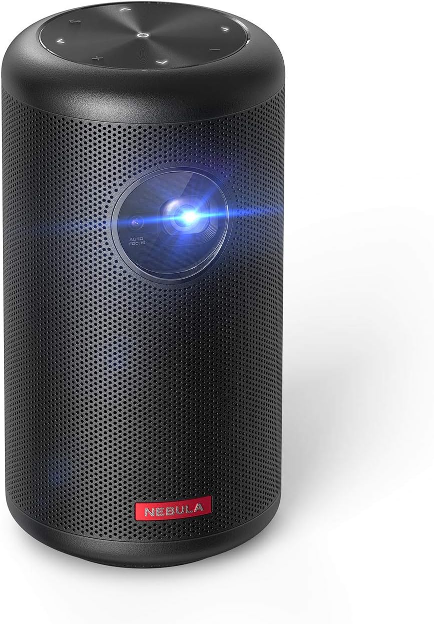 NEBULA by Anker Capsule II Mini Projector
Portable Android TV projector for movie nights, gaming, and indoor or outdoor viewing.
View on Amazon
NEBULA by Anker Capsule II Mini Projector
Portable Android TV projector for movie nights, gaming, and indoor or outdoor viewing.
View on Amazon